.png)

INTRODUCTION
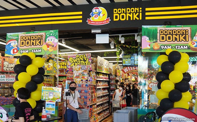
Don Don Donki is a Japanese retail chain that sells Japanese food and exclusive imported products. An article by Marketing Interactive states that between 2020 and 2021, Don Don Donki's revenue in the Singapore market was US$50.1 million, which makes up for about 11% of revenue in its Asian business. Currently, there are 12 Don Don Donki stores in Singapore.
THE PROBLEM
Despite each of its stores occupying an enormous amount of physical space, the crowd level at Don Don Donki is still relatively high compared to other retail stores. Moreover, it can get overwhelming in the store since there is a huge variety of products on display but lack of proper in-store signages. For people who shop there for leisure, it is not too much of a concern for them. However, for those on a tight schedule and who are only there to buy what they need, it may be a hassle for them to navigate their way through the entire store.
As such, I crafted a problem statement based on the issues above:
DESIGN PROCESS
For this case study, I followed the Design Thinking process closely, which consists of 5 stages:
.png)
Empathise: I learnt more about customers' concerns through a survey and an interview. This gave me a better understanding of their experiences and allowed me to have a more in-depth understanding of the different perspectives.
Define: I analysed the survey and interview findings and identified the core problems faced by customers, which were morphed together into the problem statement as shown above.
Ideate: With the help of the problem statement, I generated many different ideas and eventually decided to work on two of them.
Prototype: In progress
Test: In progress
USER RESEARCH
"Narrow lanes, very crowded"
— Participant 1
"Can be a bit overwhelming at times as the stores are usually very big and sell a lot of items. Not a lot of signboards to tell you where to find what items..."
— Participant 2
"Messy store layout, don't know if certain items are in stock at a certain outlet"
— Participant 3
"Very crowded, may be hard to navigate and find desired items, noisy and music sometimes annoying"
— Participant 4
"Very cluttered and almost messy shop with all the discounts the posters and lights everywhere"
— Participant 5
From the interview and survey, it can be seen that participants generally dislike the crowd level in the stores and feel that the store layout still has room for improvement. Some of them also mentioned about their unpleasant experience with the music played there and the sheer number of bright and flashy posters.
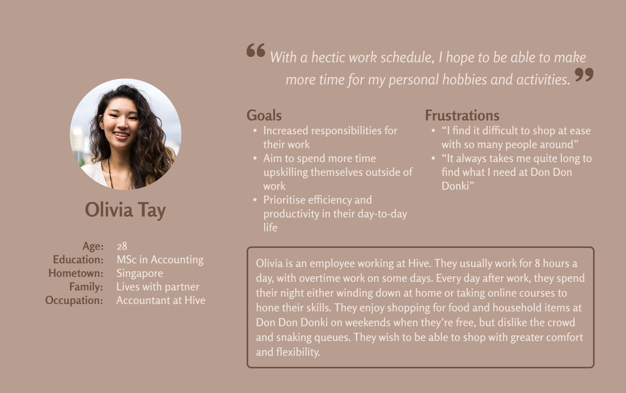
Informed by the research, I came up with a persona, Olivia Tay, to represent customers of Don Don Donki who are seeking for a more efficient and stress-free shopping experience.
THE SOLUTION
The proposed solution is to create a mobile app that not only enables users to view the crowd level at each Don Don Donki store, but also allows users to order online in advance and pick up their orders afterwards from their preferred store.
I first designed wireframes to highlight the overall layout of the app and garner feedback from potential users before moving on to the hi-fi prototype. Below is an overview of my lo-fi prototype:
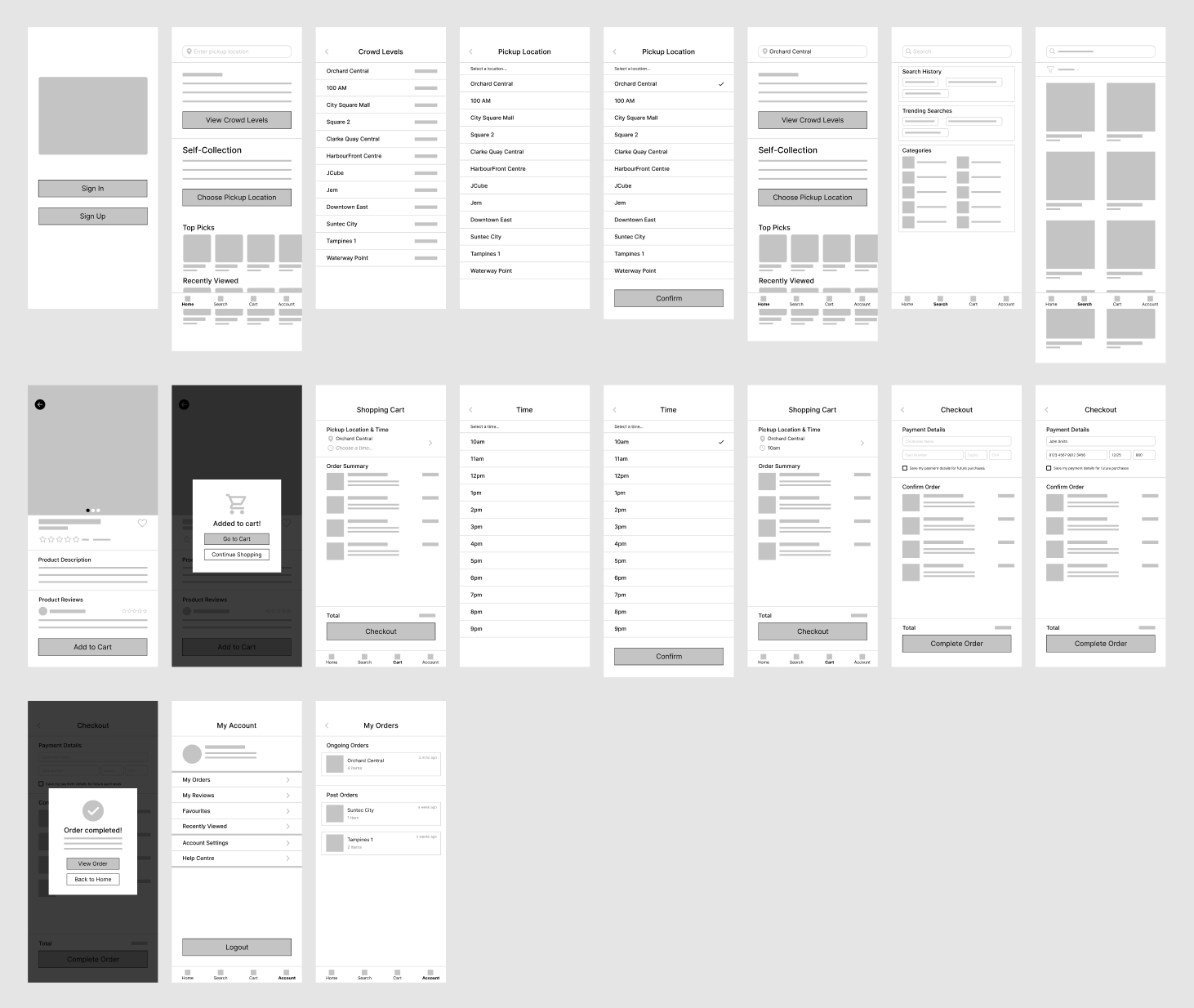
After finishing the lo-fi prototype, I conducted moderated usability study sessions with 5 participants to evaluate the effectiveness and ease of use of the design. For the sessions, I came up with standardised prompts to guide participants in performing various tasks using the interactive lo-fi prototype:
Prompt 1: How would you find out the crowd level of each branch?
Prompt 2: How would you search for a self-collection location?
Prompt 3: How would you search for something you wish to purchase?
Prompt 4: How would you add the item to cart?
Prompt 5: How would you select a preferred time for self-collection and complete the checkout process?
Prompt 6: From the home page, figure out where to view ongoing and past orders.
Following the usability study sessions, I analysed the click paths, observations and feedback from each participant and came up with a list of things to modify when moving on to the hi-fi prototype:
Home
Location search bar
Convert it to a product search bar, which is deemed more useful for users
View crowd levels
Display top 3 locations (by proximity) in the home page
Add filter function to allow users to sort by distance, crowdedness and alphabetical order
Search
Remove from navigation bar as users prefer to be able to search directly from the home page
Product details page
Use toast notification instead of a pop-up dialog box to display "Added to cart" message when user clicks on the "Add to Cart" button
Cart
Select self-collection time
Use native time picker instead of a dropdown with a list of time slots in order to better fit the context
Checkout
Include more payment options such as Apple Pay and Paypal to increase user autonomy
Allow users to add multiple cards and choose one to use each time they are about to make payment
Display "Order completed" message on a new page instead of using a pop-up dialog box
Account
View ongoing and past orders
Add an additional entry point to this page in the navigation bar since users faced some trouble finding it and it is considered one of the more important features of this app
IN PROGRESSS, TO BE CONTINUED