.png)
Shoe-perheroes
A shoe donation platform for users to donate shoes to migrant workers
Role
Group Project
Interaction Design
Visual Design
Prototyping
Timeline
Sep 2021 (2 days)
INTRODUCTION
The Problem with Limbo Shoes
Singaporeans buy 22 million pairs of shoes a year to replace existing ones, even though many shoes are still in good condition. Many Singaporeans have 'limbo shoes' - shoes that are still usable but have been replaced by newer, more fashionable or more preferred ones. Limbo shoes are often hard to resell, thus many of them end up in landfills and incinerators even though they can still be used.
Problem Statement:
How might we enable a circular economy for limbo shoes, diverting them away from landfills and incinerators?
How might we extend the lifespan of limbo shoes by passing them on to new users who need them and would appreciate them?
How might we make extending the lifespan of limbo shoes an enjoyable and fulfilling experience, as well as a self-perpetuating activity, encouraging people to continue giving the limbo shoes a second life?
THE SOLUTION
Donation of Shoes to Low-Income Migrant Workers
The solution proposed is to design an application and a physical product for people to easily donate their shoes to migrant workers while making this process a fruitful and an interpersonal one.
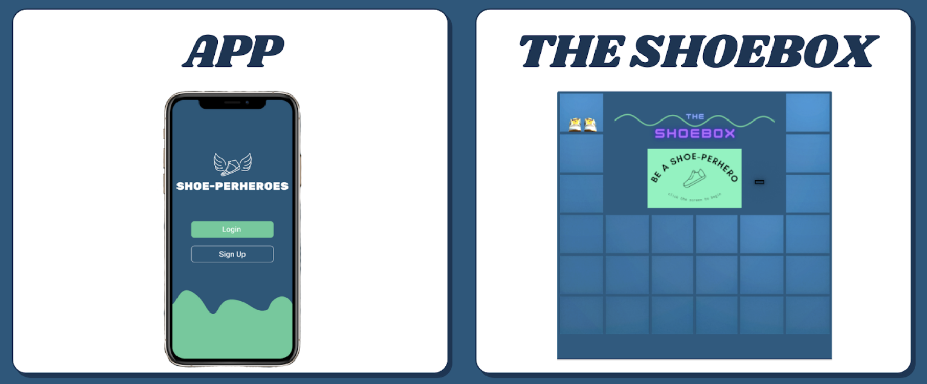
The Shoe-perheroes ecosystem comprises the app and Shoebox, the collection kiosk. The app uses computer vision to validate that donors' shoes are still usable, and directs them to the nearest drop-off point, the Shoebox kiosks. Shoebox kiosks collect donors' shoes and tag each pair to donors' accounts.
PROTOTYPING
Donor's Screens
.png)
Verify Condition of Shoes
- Fill in shoe details such as brand and how long the shoes have been worn for
- Upload images of shoes to access whether the shoes are in a good enough condition to be donated
Search for a Shoebox Kiosk
- Shoes are ready to be donated
- Find the nearest Shoebox kiosk to drop off the shoes; shoes are tagged to the donor's account
- QR code label is printed for donor to stick it onto the pair of shoes before putting them into the assigned locker
.png)
.png)
View Donations
- Beneficiary's name is shown, as well as updates on the status of the shoes
Chat with Beneficiary
- A chat session is started after beneficiary receives the pair of shoes
- Allows for meaningful interpersonal interaction to take place between donor and beneficiary
.png)
Beneficiary's Screens
.png)
Collection of Shoes
- Beneficiary can either collect shoes directly from the Shoebox kiosk or from charity drives going to their dormitory
- QR code label on the pair of shoes is scanned to confirm collection
Success!
- Donor name as well as shoe brand and model are shown
- Dashboard contains history of all the pairs of shoes received from past donors
.png)
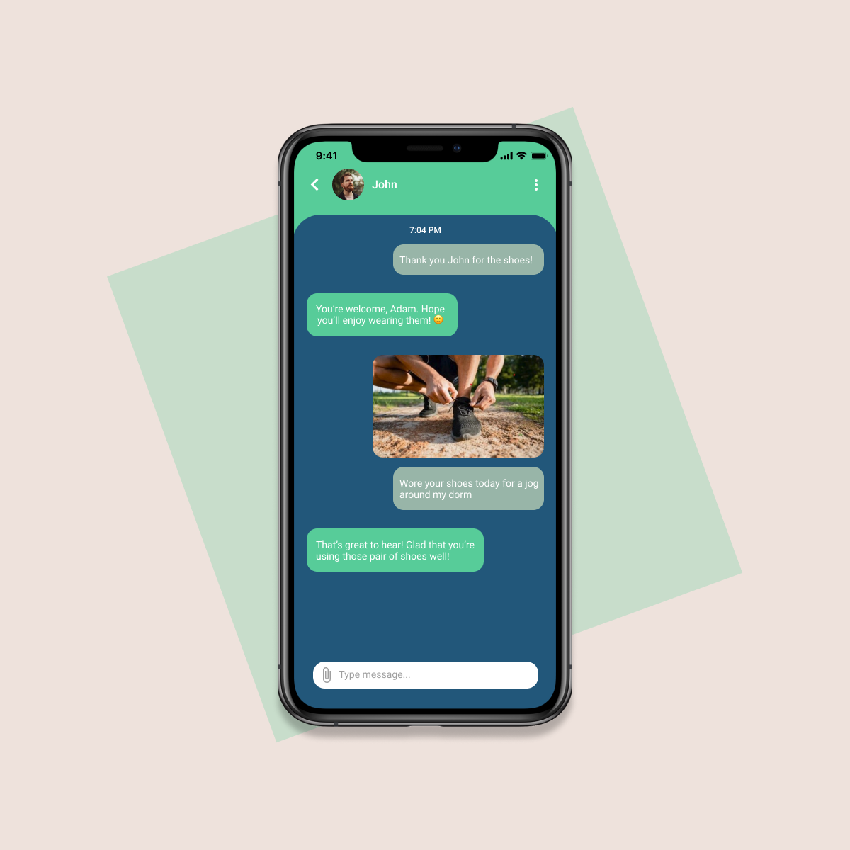
Chat with Donor
- Beneficiary is encouraged to take a photo with their new pair of shoes to send to donor, express their gratitude, as well as continue continue conversation with their donor
FINAL PRODUCT
Video Demonstration of Shoe-perheroes App
REFLECTION
What I've Learnt + Things to Improve
This was one of my very first UI projects! 🎉 My team and I came up with this idea for SUTD's What The Hack 2021 hackathon, thus we only had 24 hours to iterate and design the final prototype. Looking back, I definitely feel that there is much room for improvement in terms of the UI design, especially since I did not take UX into account. Nevertheless, I'm immensely grateful for this opportunity as it kickstarted my passion for UI/UX. Here are a few things I've learnt:
- Attention to detail is very important. Due to my inexperience back then, I failed to put enough focus on some of the visual aspects, such as padding and colour theory. As such, this led to inconsistency in the designs and some words were hard to read, such as the green headers. I stumbled across the WCAG guidelines after this hackathon and made sure to obey the standards and design with intention next time!
- Take some time to thoroughly plan out the layout of the app before prototyping. I wasted a lot of time changing the layout of different sections of the app on Figma because I wasn't fully sure of where to place each part of the content. Through this experience, I've learnt the importance of wireframing, which gives an overview of the architecture and user flow of the app.
- It's okay to fail and try again. Since I was still new to Figma, I felt overwhelmed with all the different functionalities of the software. At one point, I was so demoralised that I wanted to give up and create a subpar design. However, I'm glad that I didn't take the easy route and pushed myself to learn by doing. I find this applicable to so many aspects of UI/UX design and I hope to become more confident in whatever I do.
.png)