INTRODUCTION
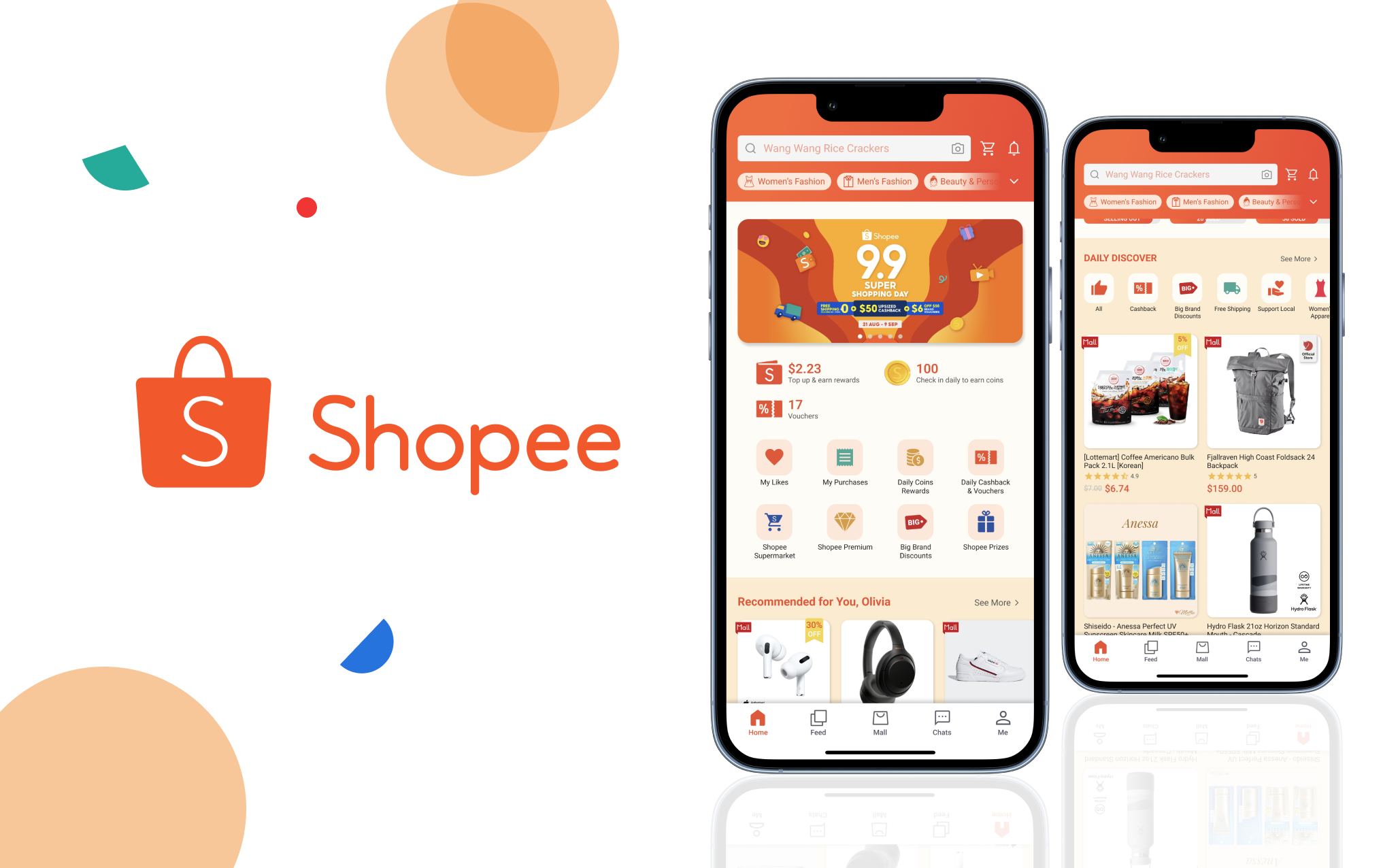
Shopee is an e-commerce platform that operates on a hybrid of consumer-to-consumer (C2C) and business-to-customer (B2C) business model. Users can shop from a comprehensive selection of categories, ranging from fashion and skincare to electronics and gym equipment. As of 2021, Shopee attracted 343 million visitors monthly, evolving as the leading e-commerce platform in Southeast Asia and Taiwan.
THE CHALLENGE
The home page is the very first thing that users interact with when they open the Shopee app. Currently, the click rate performance of each module on the home page is not good enough as it is not common for users to look through all the features in the home page. As humans, first impression bias comes naturally to us, hence it is crucial for the home page, which is the face of the app, to be designed in a way that attracts more users to explore the various sections and stay on the app for a longer period of time, potentially bringing about more revenue and returning users in the long run.
To address this challenge, I crafted this problem statement:
DESIGN PROCESS
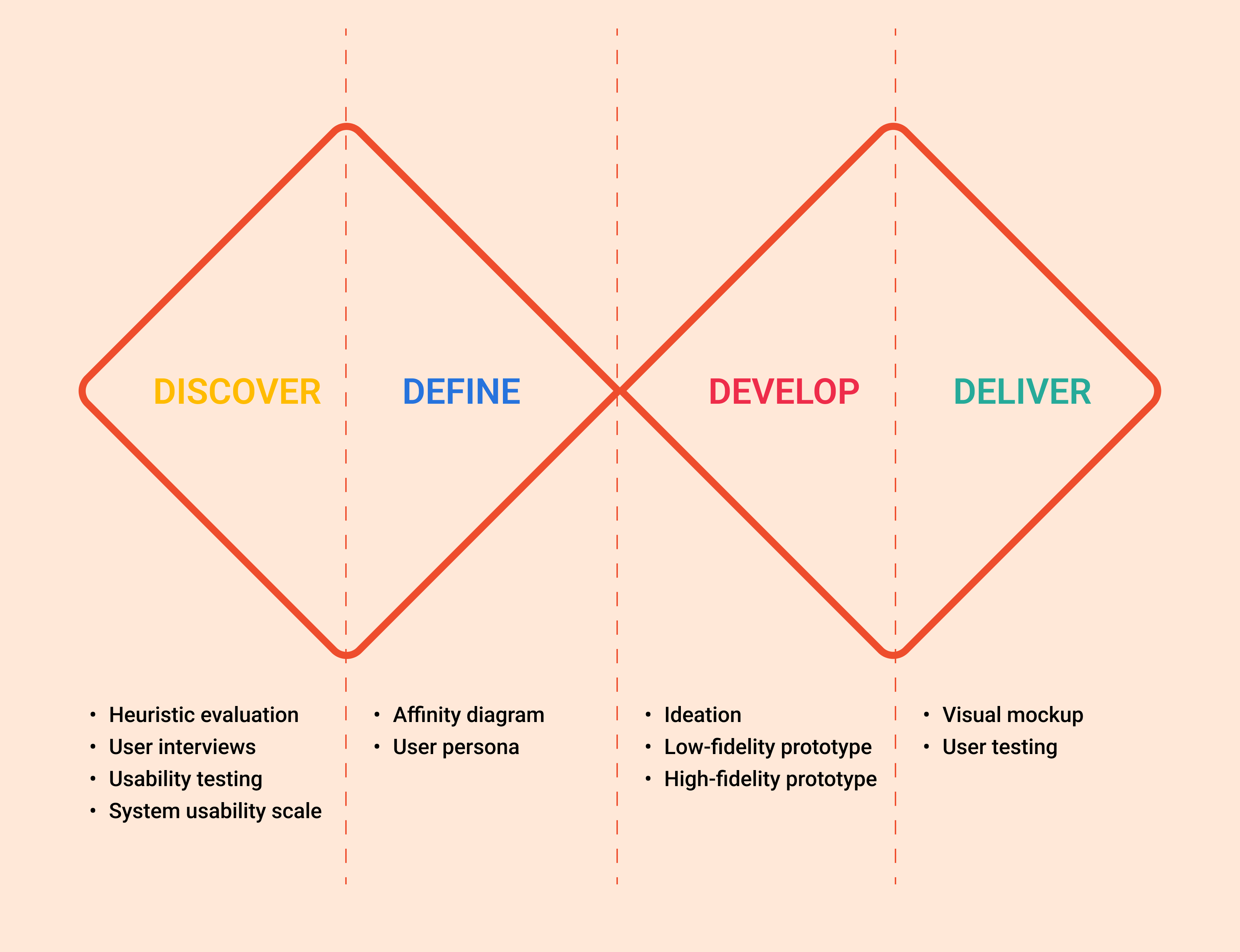
To explore the issue more deeply, I decided to use Design Council's Double Diamond model since it allows me to be more flexible with the various research methods and techniques I'll be choosing in order to better understand user needs and pain points.
STEP 1: DISCOVER
Using the Nielsen-Molich heuristics, I first evaluated the user friendliness of the current home page of the Shopee app to quickly identify potential areas of improvement.
.png)
Overall, I found a few main problems with the home page:
Overwhelming due to lack of visual hierarchy and difficulty in searching for the sections I was interested in
Horizontal scrolling menu below the carousel contains a huge number of icons, which made me feel very disoriented
Hard to grasp the difference between some of the icons in terms of their purposes, such as 'Daily 10% Cashback' versus 'Daily Vouchers' for instance
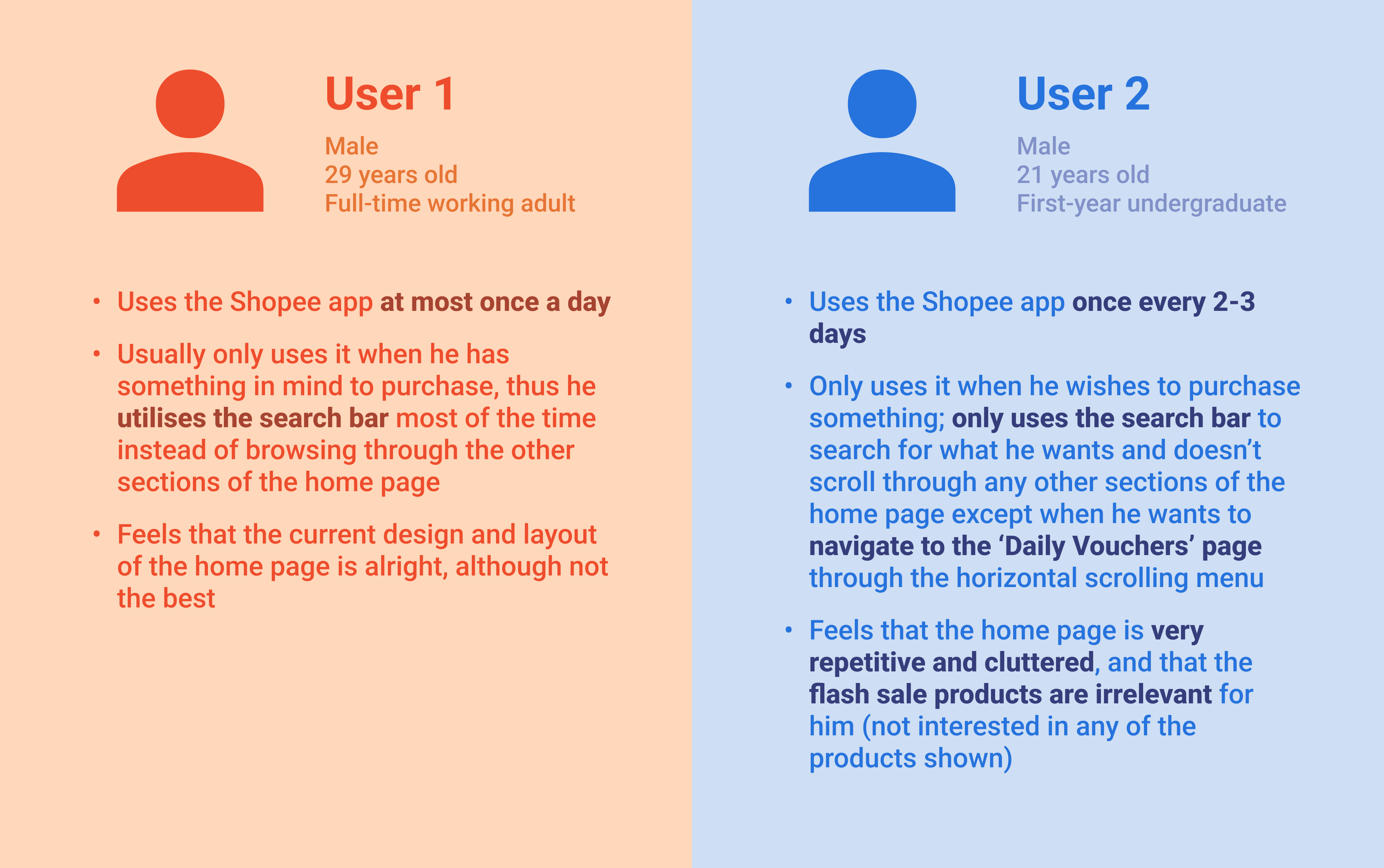
In order to find out more about the sentiments that other users have towards the Shopee app as well as to validate my own assumptions and observations, I conducted preliminary user interviews with 2 users and asked them a few general questions, such as:
How frequently they use the Shopee app,
What steps they would take whenever they wish to purchase something on the app, and
What their opinions of the current Shopee home page are.
After the user interview, I conducted moderated usability testing for each of the users I interviewed. I requested them to carry out 2 separate tasks while observing how they navigated the home page and analysing their click patterns and thought processes for each task.
Users generally did not face any trouble completing this task
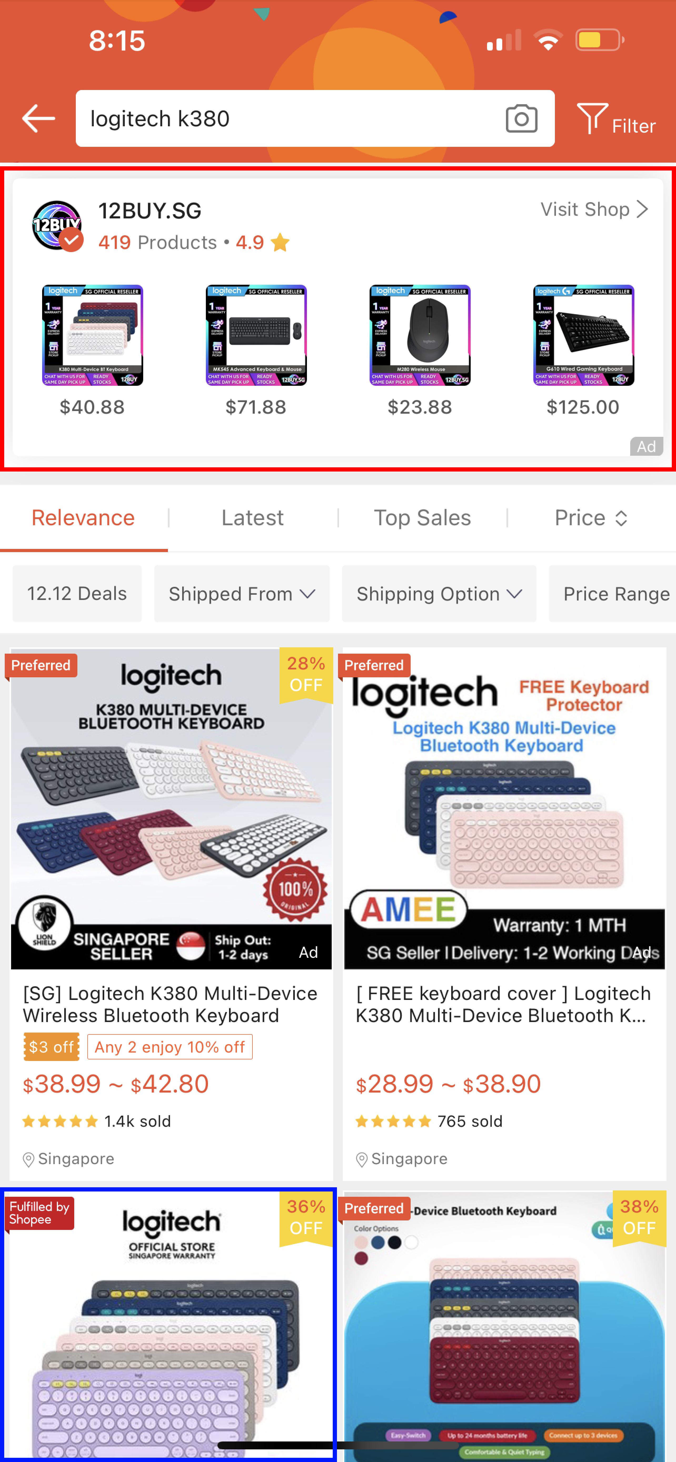
Users used the search bar to type in the name of the product and decided on which product listing to click into based on the price and number of sales
One of the users mentioned that he would also check if there is an official store selling the product, and that he would avoid advertised listings
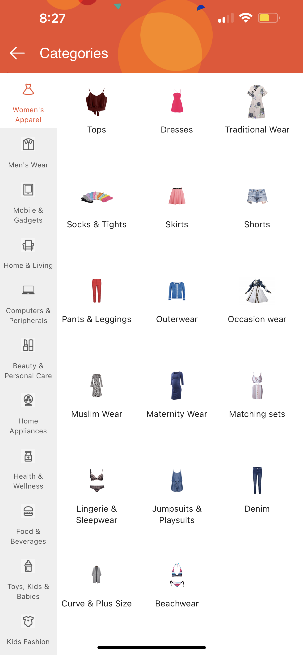
Users faced quite a bit of difficulty in finding the appropriate category
Users displayed confusion and frustration when carrying out this task, and felt that the 'All Categories' icon should be made more obvious instead of being put in an inconspicuous place
One of the users mentioned how he disliked the scrolling list of categories on the left side of the page after clicking into 'All Categories'; would be much easier to display all the categories on a full page without having to scroll so much
After the usability testing session, I gave each of the users a System Usability Scale (SUS) questionnaire consisting of 10 questions to obtain quantitative feedback regarding the usability of the current Shopee home page. The list of questions asked is as follows:
I think that I would use the home page frequently.
I found the home page unnecessarily complex.
I thought the home page was easy to use.
I think that I would need the support of a technical person to be able to use the home page.
I found the various functions in the home page to be well-integrated.
I thought there was too much inconsistency in the home page.
I imagine that most people would learn to use the home page very quickly.
I found the home page very cumbersome to use.
I felt very confident using the home page.
I needed to learn a lot of things before I could start using the home page.
The scoring is based on a 5-point Likert scale from 'Strongly Disagree' to 'Strongly Agree', which are assigned the numbers 1 to 5 respectively. The image below shows the average SUS score obtained from the users versus the standardised average SUS score.
From the results obtained, the average SUS score among the users was calculated to be 51.25 out of 100, which is below the standardised average SUS score of 68. This highlights that users experienced low levels of satisfaction when using the Shopee home page, implying poor usability of the home page compared to industry standards.
STEP 2: DEFINE
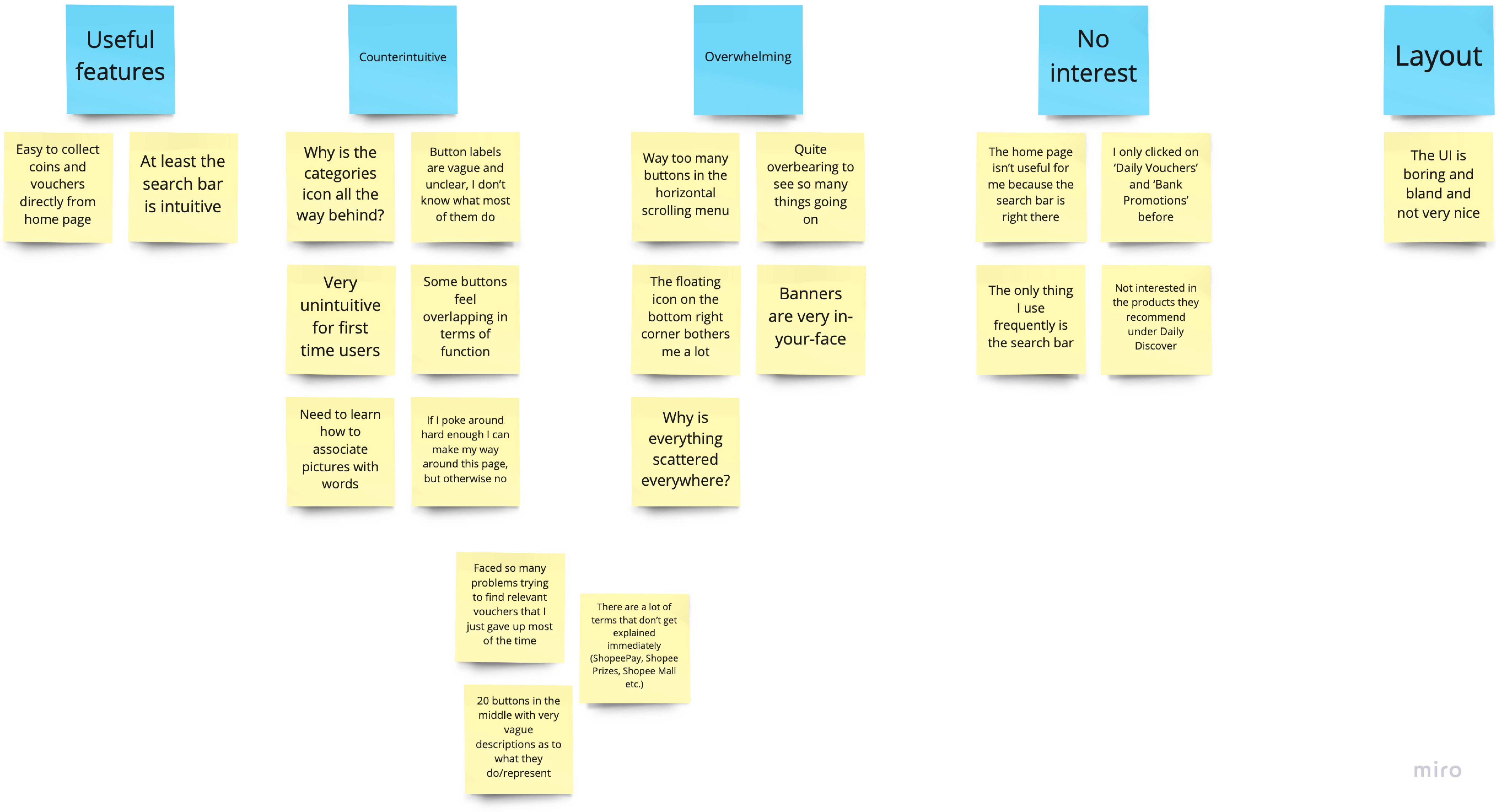
After consolidating and organising all the feedback and concerns from the user research, I came up with an affinity diagram to categorise the common issues that users face.
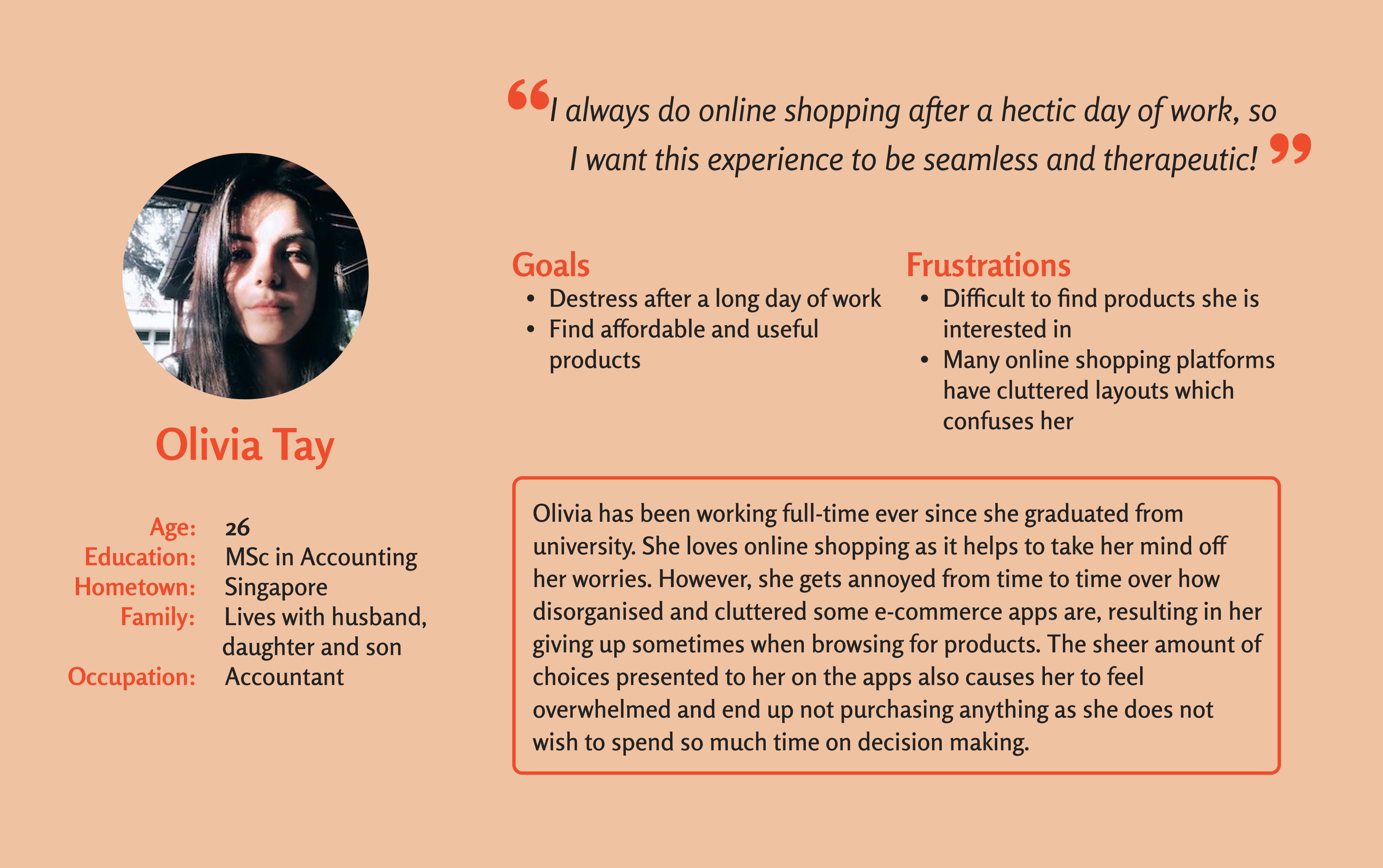
From the research findings, I came up with a user persona that highlights the goals and frustrations of users.
STEP 3: DEVELOP
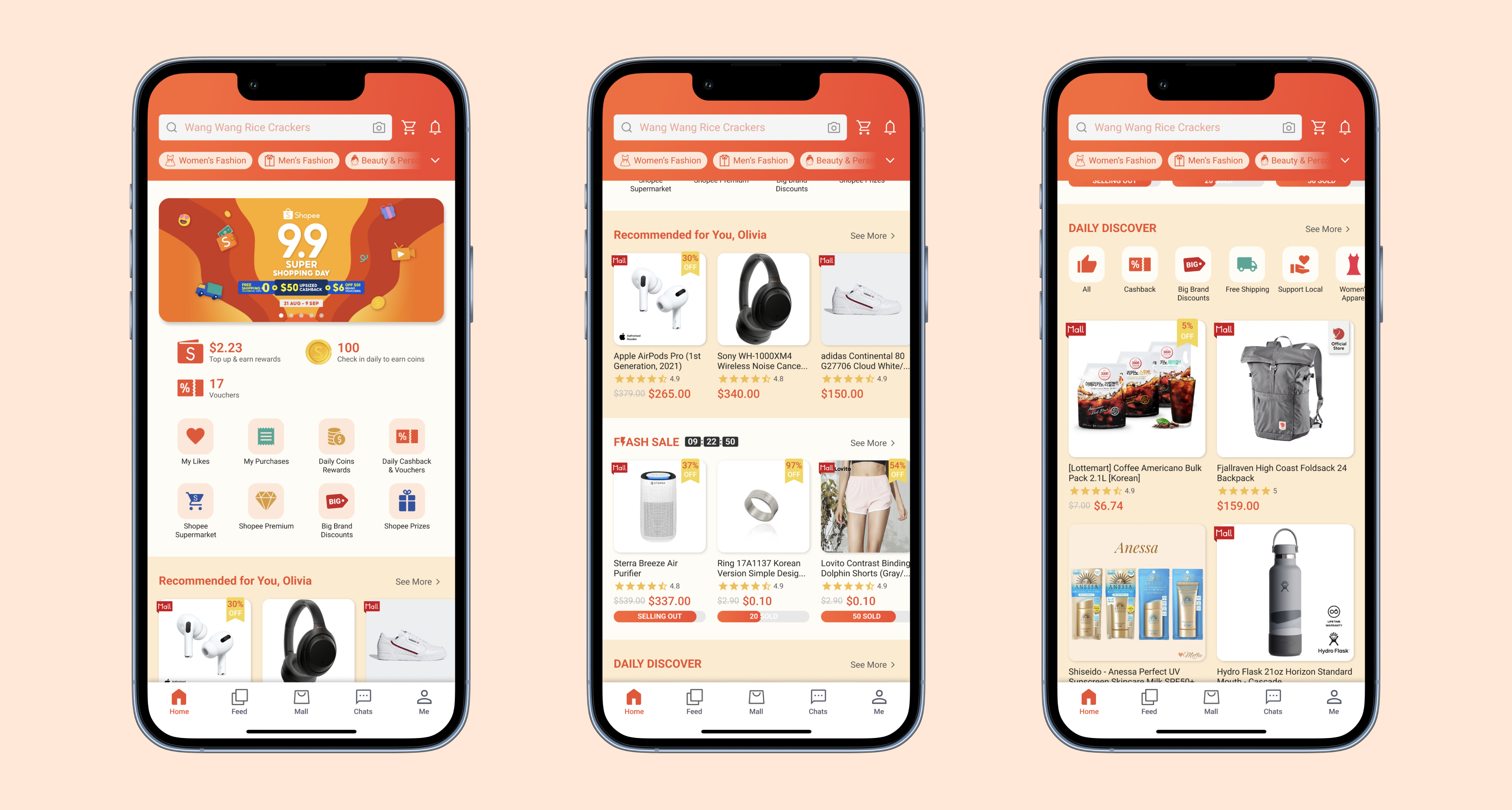
These are the features that I decided to implement in the new home page:
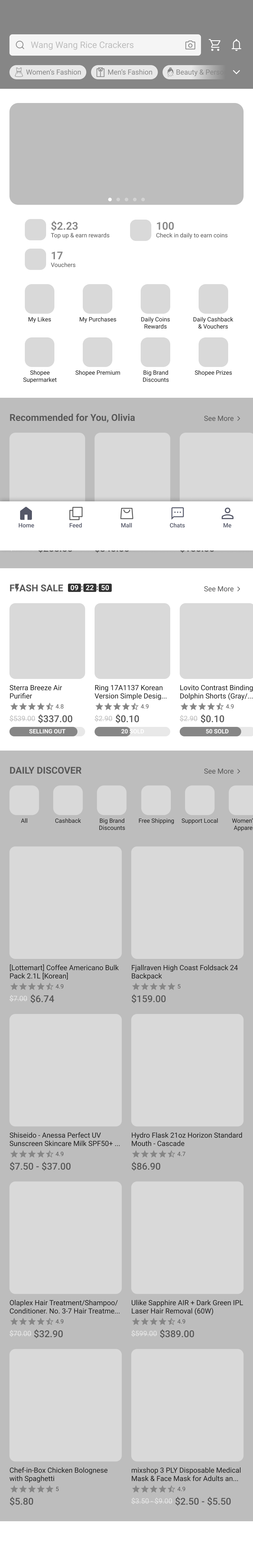
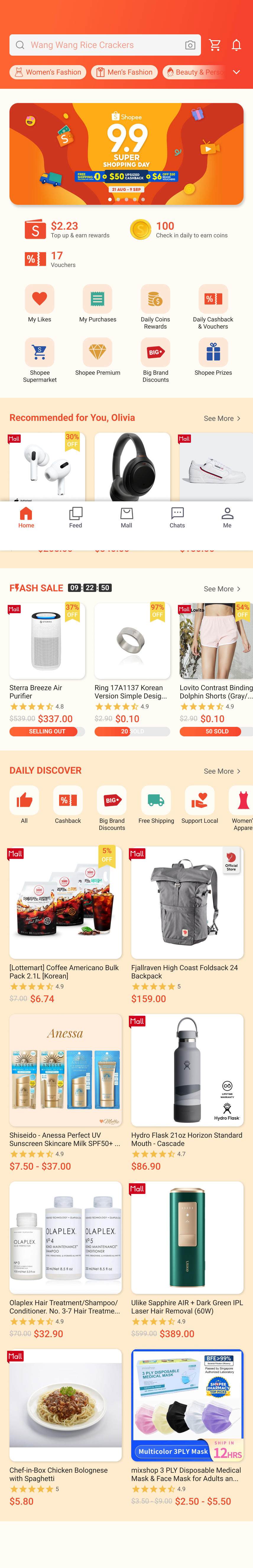
Sticky top bar comprising of search bar and list of categories
Carousel with reduced number of banners
Shortened horizontal scrolling menu
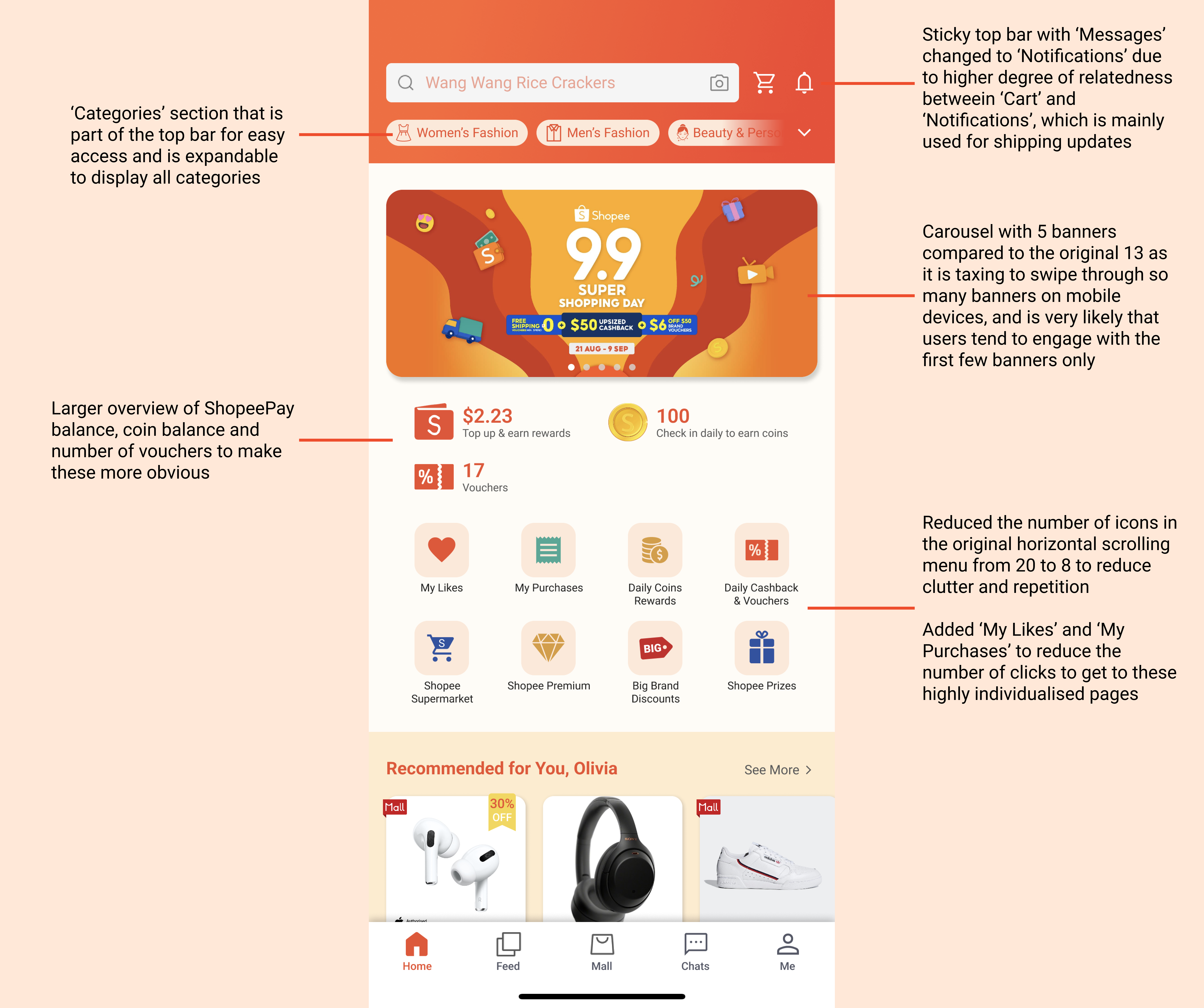
Recommended for You
Flash Sale
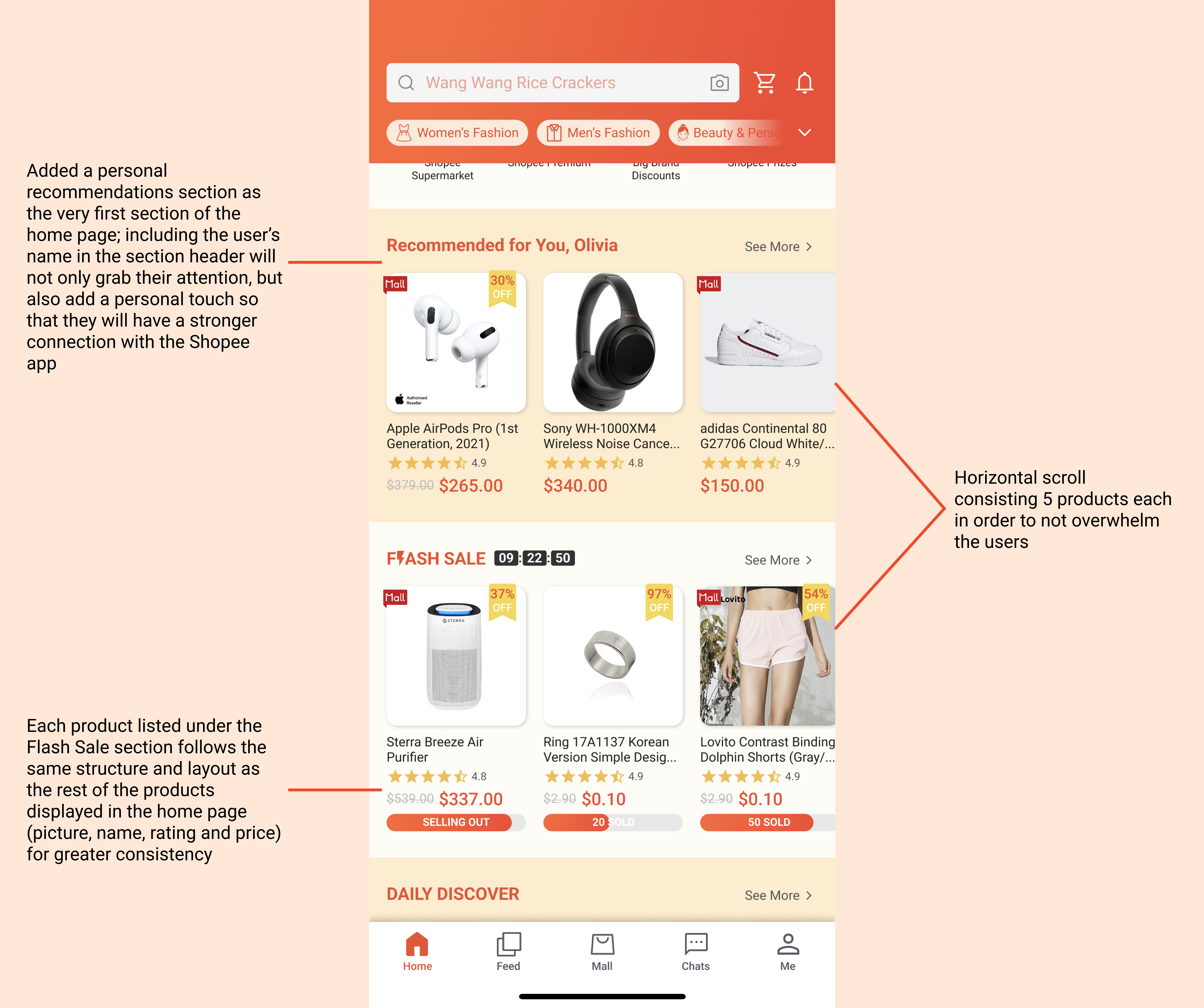
Daily Discover
Greater overall emphasis on different shades of orange for the colour scheme to bring out greater brand awareness and more memorable first impressions
I decided to stick to the layout of the current Shopee home page as much as possible to not only improve coherency and preserve the brand identity, but also allow users to have a smoother and more pleasant experience navigating the home page.
STEP 4: DELIVER
After redesigning the home page, I conducted user testing for my final prototype with the same 2 users as before through interviews and the System Usability Scale (SUS) again. These are what the users said:
There is a marked improvement in their experience with the home page due to more whitespace that improves readability
Overall reduction in number of icons and products displayed leads to less clutter and greater willingness to browse the different sections of the home page
One of them added that showing the ratings and both the original and discounted prices for all the products allows him to make more informed decisions and have a better overview of the product without having to click into the product details page to obtain more information
For the final prototype, the average SUS score is 77.5 out of 100, which is a 51.2% improvement in terms of usability.
CONCLUSION
Overall, I gained a lot of new insights through this task despite only having 36 hours to complete it. If given more time, I would improve on the following areas:
Gather research data from more users of varying demographics: I only managed to interview 2 users who are roughly from the same age group since I did not manage to find users from other demographics during this period of time
Explore more user research methods: find out and analyse the most suitable research methods to use for this particular task
Build an interactive prototype: more beneficial for user testing as it provides a simulation that allows users to get a fuller and more accurate experience as to how they would use the redesigned app